

دانلود فايل , شرکت در انجمن و گفتگو با ساير اعضا در سايت ثبت نام کنيد
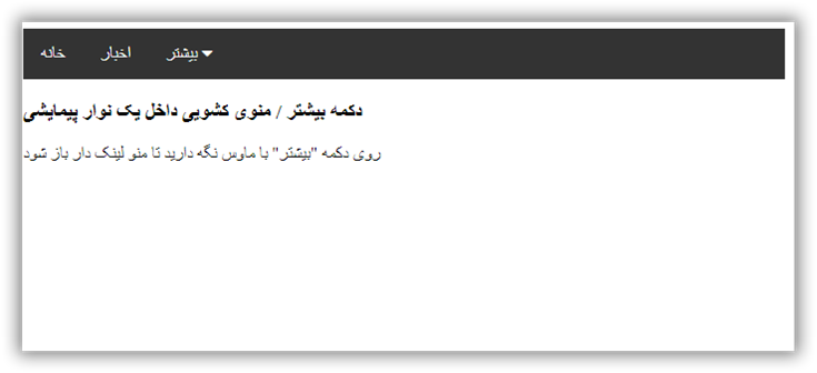
آموزش طراحی منو برای دکمه بیشتر "More"
تاريخ: امروز, : یکشنبه 09 خرداد 1400 نويسنده: http://tahlilgardadeh.rozblog.com/user-admin
موضوع: آموزش طراحی سایت ,
آموزش طراحی سایت - آموزش طراحی منو برای دکمه بیشتر "More"
دانلودآموزش طراحی سایت
آموزش ایجاد دکمه More Button in Navbar در وب
در این مقاله می آموزیم که چطور با استفاده از کد CSS , Html دکمه" more " ایجاد کنیم.
قدم اول : کد HTML را اضافه کنید.
مثال :
یک navigation bar بصورت dropdown ایجاد کنید
یک منوی dropdown ایجاد کنید به این صورت که زمانی که کاربر ماوس را بر روی عناصر داخل navigation bar میبرد ، نمایان گردد.
            <div class="navbar">
  <a href="#home">Home</a>
  <a href="#news">News</a>
  <div class="dropdown">
    <button class="dropbtn">More
      <i class="fa fa-caret-down"></i>
    </button>
    <div class="dropdown-content">
      <a href="#">Link 1</a>
      <a href="#">Link 2</a>
      <a href="#">Link 3</a>
    </div>
  </div>
</div>
توضیح مثال : از هر مولفه ای برای باز کردن منوی dropdown استفاده کنید برای مثال مولفه .
از مولفه container ( مانند ) برای ایجاد منوی dropdown استفاده کنید و لینک های dropdown را به آن اضافه کنید.
مولفه را در ابتدا و انتهای دکمه قرار دهید تا منوی dropdown را بخوبی توسط کد css جایدهی کنید.
قدم دوم : کد CSS را اضافه کنید.
مثال :
            /* Navbar container */
.navbar {
  overflow: hidden;
  background-color: #333;
  font-family: Arial;
}

/* Links inside the navbar */
.navbar a {
  float: left;
  font-size: 16px;
  color: white;
  text-align: center;
  padding: 14px 16px;
  text-decoration: none;
}

/* The dropdown container */
.dropdown {
  float: left;
  overflow: hidden;
}

/* Dropdown button */
.dropdown .dropbtn {
  font-size: 16px;
  border: none;
  outline: none;
  color: white;
  padding: 14px 16px;
  background-color: inherit;
  font-family: inherit; /* Important for vertical align on mobile phones */
  margin: 0; /* Important for vertical align on mobile phones */
}

/* Add a red background color to navbar links on hover */
.navbar a:hover, .dropdown:hover .dropbtn {
  background-color: red;
}

/* Dropdown content (hidden by default) */
.dropdown-content {
  display: none;
  position: absolute;
  background-color: #f9f9f9;
  min-width: 160px;
  box-shadow: 0px 8px 16px 0px rgba(0,0,0,0.2);
  z-index: 1;
}

/* Links inside the dropdown */
.dropdown-content a {
  float: none;
  color: black;
  padding: 12px 16px;
  text-decoration: none;
  display: block;
  text-align: left;
}

/* Add a grey background color to dropdown links on hover */
.dropdown-content a:hover {
  background-color: #ddd;
}

/* Show the dropdown menu on hover */
.dropdown:hover .dropdown-content {
  display: block;
}
نمونه یک
توضیح مثال : ما به navigation bar و لینک های آن توسط background-color ، padding و غیره فرم دادیم.
ما به دکمه dropdown توسط background-color ، padding و غیره فرم دادیم.
کلاس dropdown. یک container برای dropdown-content. می باشد.تا زمانیکه مولفه div باشد، نه مولفه a ، باید از Float استفاده کنیم تا اطمینان حاصل کنیم که در کنار لینک ها قرار میگیرد.
کلاس dropdown-content. در برگیرنده منوی dropdown میباشد. بصورت پیش فرض پنهان است و در هاور ( بصورت زیر) نمایش داده میشود. توجه داشته باشید که مقدار min-width را 160px قرار دهید. و برای تغییر ، میتوانید آنرا مقداردهی نکنید.
بجای استفاده از border ، از ویژگی box-shadow استفاده کردیم تا منوی dropdown به شکل کارت نمایان شود. همچنین از z-index استفاده میکنیم تا dropdown را جلوی سایر عناصر قرار دهیم.
از سلکتور hover: برای نمایش منوی dropdown زمانیکه کاربر ماوس را برروی دکمه dropdown میبرد ، استفاده میشود
نمونه دکمه" more "
| امتياز : | نتيجه : 0 امتياز توسط 0 نفر مجموع امتياز : 0 |

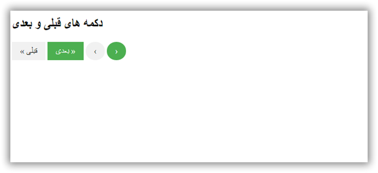
طراحی دکمه صفحه های قبلی و بعدی سایت
تاريخ: امروز, : جمعه 07 خرداد 1400 نويسنده: http://tahlilgardadeh.rozblog.com/user-admin
موضوع: آموزش طراحی سایت ,
طراحی دکمه صفحه های قبلی و بعدی سایت
دانلودآموزش طراحی سایت
استایل دکمه های بعدی و قبلی Next and Previous Buttons در وب
در این مقاله می آموزیم که چطور با استفاده از کد CSS , Html دکمه های بعدی و قبلی Next and Previous Buttons ایجاد کنیم.
قدم اول : کد HTML را اضافه کنید.
مثال :
<a href="#" class="previous">« Previous</a>
<a href="#" class="next">Next »</a>

<a href="#" class="previous round">‹</a>
<a href="#" class="next round">›</a>
قدم دوم : کد CSS را اضافه کنید.
مثال :
               a {
  text-decoration: none;
  display: inline-block;
  padding: 8px 16px;
}

a:hover {
  background-color: #ddd;
  color: black;
}

.previous {
  background-color: #f1f1f1;
  color: black;
}

.next {
  background-color: #4CAF50;
  color: white;
}

.round {
  border-radius: 50%;
}
نمونه یک
<!DOCTYPE html>
<html>
<head>
<meta name="viewport" content="width=device-width, initial-scale=1">
<style>
a {
text-decoration: none;
display: inline-block;
padding: 8px 16px;
}
a:hover {
background-color: #ddd;
color: black;
}
.previous {
background-color: #f1f1f1;
color: black;
}
.next {
background-color: #4CAF50;
color: white;
}
.round {
border-radius: 50%;
}
</style>
</head>
<body>
<h2>دکمه های قبلی و بعدی</h2>
<a href="#" class="previous">« قبلی</a>
<a href="#" class="next">بعدی »</a>
<a href="#" class="previous round">‹</a>
<a href="#" class="next round">›</a>
</body>
</html>
نمونه دکمه های بعدی و قبلی Next and Previous Buttons
| امتياز : | نتيجه : 0 امتياز توسط 0 نفر مجموع امتياز : 0 |
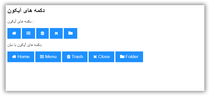
آموزش طراحی دکمه ایکون در website
تاريخ: امروز, : چهارشنبه 05 خرداد 1400 نويسنده: http://tahlilgardadeh.rozblog.com/user-admin
موضوع: آموزش طراحی سایت ,
آموزش طراحی سایت - آموزش طراحی دکمه ایکون در website
آموزش رایگان طراحی سایت
آموزش ایجاد دکمه آیکون Icon Buttons در وب
در این مقاله می آموزیم که چطور با استفاده از کد CSS , Html آیکون Icon Buttons ایجاد کنیم.
قدم اول : کد HTML را اضافه کنید.
مثال :
<!-- Add icon library -->
<link rel="stylesheet" href="https://cdnjs.cloudflare.com/ajax/libs/font-awesome/4.7.0/css/font-awesome.min.css">

                    <!-- Add font awesome icons to buttons  -->
<p>Icon buttons:</p>
<button class="btn"><i class="fa fa-home"></i></button>
<button class="btn"><i class="fa fa-bars"></i></button>
<button class="btn"><i class="fa fa-trash"></i></button>
<button class="btn"><i class="fa fa-close"></i></button>
<button class="btn"><i class="fa fa-folder"></i></button>

<p>Icon buttons with text:</p>
<button class="btn"><i class="fa fa-home"></i> Home</button>
<button class="btn"><i class="fa fa-bars"></i> Menu</button>
<button class="btn"><i class="fa fa-trash"></i> Trash</button>
<button class="btn"><i class="fa fa-close"></i> Close</button>
<button class="btn"><i class="fa fa-folder"></i> Folder</button>
قدم دوم : کد CSS را اضافه کنید.
مثال :
                /* Style buttons */
.btn {
  background-color: DodgerBlue; /* Blue background */
  border: none; /* Remove borders */
  color: white; /* White text */
  padding: 12px 16px; /* Some padding */
  font-size: 16px; /* Set a font size */
  cursor: pointer; /* Mouse pointer on hover */
}

/* Darker background on mouse-over */
.btn:hover {
  background-color: RoyalBlue;
}
نمونه یک
| امتياز : | نتيجه : 0 امتياز توسط 0 نفر مجموع امتياز : 0 |
آموزش ایجاد دکمه اعلان در سایت
تاريخ: امروز, : سه شنبه 04 خرداد 1400 نويسنده: http://tahlilgardadeh.rozblog.com/user-admin
موضوع: آموزش طراحی سایت ,
آموزش طراحی سایت - آموزش ایجاد دکمه اعلان در سایت
آموزش رایگان طراحی سایت
آموزش ایجاد دکمه اعلان Notification Buttons در وبسایت
در این مقاله می آموزیم که چطور با استفاده از کد CSS , Html اعلان Notification Buttons ایجاد کنیم.
قدم اول : کد HTML را اضافه کنید.
مثال :
<a href="#" class="notification">
  <span>Inbox</span>
  <span class="badge">3</span>
</a>
قدم دوم : کد CSS را اضافه کنید.
مثال :
    .notification {
  background-color: #555;
  color: white;
  text-decoration: none;
  padding: 15px 26px;
  position: relative;
  display: inline-block;
  border-radius: 2px;
}

.notification:hover {
  background: red;
}

.notification .badge {
  position: absolute;
  top: -10px;
  right: -10px;
  padding: 5px 10px;
  border-radius: 50%;
  background: red;
  color: white;
}
نمونه یک
<!DOCTYPE html>
<html>
<head>
<meta name="viewport" content="width=device-width, initial-scale=1">
<style>
body {
  font-family: Arial, Helvetica, sans-serif;
}

.notification {
  background-color: #555;
  color: white;
  text-decoration: none;
  padding: 15px 26px;
  position: relative;
  display: inline-block;
  border-radius: 2px;
}

.notification:hover {
  background: red;
}

.notification .badge {
  position: absolute;
  top: -10px;
  right: -10px;
  padding: 5px 10px;
  border-radius: 50%;
  background-color: red;
  color: white;
}
</style>
</head>
<body>

<h1>دکمه اعلان</h1>

<a href="#" class="notification">
  <span>Inbox</span>
  <span class="badge">3</span>
</a>

</body>
</html>
عکس دکمه اعلان Notification Buttons

| امتياز : | نتيجه : 0 امتياز توسط 0 نفر مجموع امتياز : 0 |
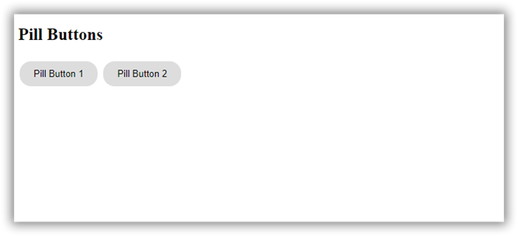
آموزش طراحی دکمه Pill Buttons در وب
تاريخ: امروز, : یکشنبه 02 خرداد 1400 نويسنده: http://tahlilgardadeh.rozblog.com/user-admin
موضوع: آموزش طراحی سایت ,
آموزش طراحی سایت - آموزش طراحی دکمه Pill Buttons در وب
فیلم آموزش طراحی سایت
ایجاد دکمه Pill Buttons در وبسایت
در این مقاله می آموزیم که چطور با استفاده از کد CSS , Html دکمه Pill Buttons ایجاد کنیم.
قدم اول : کد HTML را اضافه کنید.
مثال :
<button class="button">Pill Button</button>
قدم دوم : کد CSS را اضافه کنید.
مثال :
       .button {
  background-color: #ddd;
  border: none;
  color: black;
  padding: 10px 20px;
  text-align: center;
  text-decoration: none;
  display: inline-block;
  margin: 4px 2px;
  cursor: pointer;
  border-radius: 16px;
}
نمونه یک
| امتياز : | نتيجه : 0 امتياز توسط 0 نفر مجموع امتياز : 0 |
آموزش طراحی سایت -ساخت انواع دکمه دانلود
تاريخ: امروز, : جمعه 31 اردیبهشت 1400 نويسنده: http://tahlilgardadeh.rozblog.com/user-admin
موضوع: آموزش طراحی سایت ,
آموزش طراحی سایت -ساخت انواع دکمه دانلود
فیلم آموزش طراحی سایت
ایجاد دکمه دانلود (Download Buttons) در سایت
در این مقاله می آموزیم که چطور با استفاده از کد CSS , Html دکمه های دانلود (Download Buttons) ایجاد کنیم.
چگونه دکمه های دانلود ایجاد کنیم::
به دکمه های HTML ، دستور icon library مانند Font Awesome را اضافه کنید:
قدم اول : کد HTML را اضافه کنید.
مثال :
              <!-- Add icon library -->
<link rel="stylesheet" href="https://cdnjs.cloudflare.com/ajax/libs/font-awesome/4.7.0/css/font-awesome.min.css">

                    <!-- Auto width -->
<button class="btn"><i class="fa fa-download"></i> Download</button>

                    <!-- Full width -->
<button class="btn" style="width:100%"><i class="fa fa-download"></i> Download</button>
قدم دوم : کد CSS را اضافه کنید.
مثال :
           /* Style buttons */
.btn {
  background-color: DodgerBlue;
  border: none;
  color: white;
  padding: 12px 30px;
  cursor: pointer;
  font-size: 20px;
}

/* Darker background on mouse-over */
.btn:hover {
  background-color: RoyalBlue;
}
نمونه یک
<!DOCTYPE html>
<html>
<head>
<meta name="viewport" content="width=device-width, initial-scale=1">
<!-- Add icon library -->
<link rel="stylesheet" href="https://cdnjs.cloudflare.com/ajax/libs/font-awesome/4.7.0/css/font-awesome.min.css">
<style>
.btn {
background-color: DodgerBlue;
border: none;
color: white;
padding: 12px 30px;
cursor: pointer;
font-size: 20px;
}
/* Darker background on mouse-over */
.btn:hover {
background-color: RoyalBlue;
}
</style>
</head>
<body>
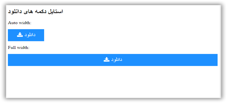
<h2>استایل دکمه های دانلود</h2>
<p>Auto width:</p>
<button class="btn"><i class="fa fa-download"></i> دانلود</button>
<p>Full width:</p>
<button class="btn" style="width:100%"><i class="fa fa-download"></i> دانلود</button>
</body>
</html>
عکس دکمه های دانلود (Download Buttons)
| امتياز : | نتيجه : 0 امتياز توسط 0 نفر مجموع امتياز : 0 |
پروژه طراحی سایت - آموزش اضافه کردن دکمه بارگذاری در وب سایت
تاريخ: امروز, : پنجشنبه 30 اردیبهشت 1400 نويسنده: http://tahlilgardadeh.rozblog.com/user-admin
موضوع: آموزش طراحی سایت ,
پروژه طراحی سایت - آموزش اضافه کردن دکمه بارگذاری در وب سایت
فیلم آموزش طراحی سایت
نحوه اضافه کردن دکمه های بارگذاری (Loading Buttons) در سایت
در این مقاله می آموزیم که چطور با استفاده از کد CSS , Html دکمه های بارگذاری (Loading Buttons) ایجاد کنیم.
چگونه دکمه های بارگذاری را فرم دهیم:
قدم اول : کد HTML را اضافه کنید.
مثال :
                   <!-- Add icon library -->
<link rel="stylesheet" href="https://cdnjs.cloudflare.com/ajax/libs/font-awesome/4.7.0/css/font-awesome.min.css">

                    <!-- Add font awesome icons to buttons (note that the fa-spin class rotates the icon) -->
<button class="buttonload">
  <i class="fa fa-spinner fa-spin"></i>Loading
</button>

<button class="buttonload">
  <i class="fa fa-circle-o-notch fa-spin"></i>Loading
</button>

<button class="buttonload">
  <i class="fa fa-refresh fa-spin"></i>Loading
</button>
قدم دوم : کد CSS را اضافه کنید.
مثال :
نمونه یک
<!DOCTYPE html>
<html>
<head>
<link rel="stylesheet" href="https://cdnjs.cloudflare.com/ajax/libs/font-awesome/4.7.0/css/font-awesome.min.css">
<meta name="viewport" content="width=device-width, initial-scale=1">
<style>
.buttonload {
background-color: #4CAF50; /* Green background */
border: none; /* Remove borders */
color: white; /* White text */
padding: 12px 24px; /* Some padding */
font-size: 16px; /* Set a font-size */
}
/* Add a right margin to each icon */
.fa {
margin-left: -12px;
margin-right: 8px;
}
</style>
</head>
<body>
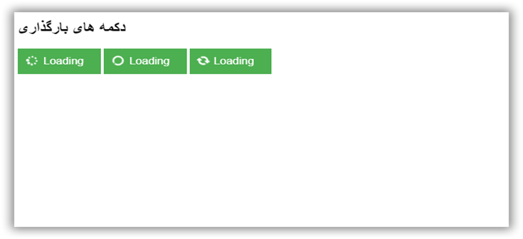
<h2>دکمه های بارگذاری</h2>
<button class="buttonload">
<i class="fa fa-spinner fa-spin"></i>Loading
</button>
<button class="buttonload">
<i class="fa fa-circle-o-notch fa-spin"></i>Loading
</button>
<button class="buttonload">
<i class="fa fa-refresh fa-spin"></i>Loading
</button>
</body>
</html>
عکس دکمه های بارگذاری (Loading Buttons)
| امتياز : | نتيجه : 0 امتياز توسط 0 نفر مجموع امتياز : 0 |
پروژه طراحی سایت -نحوه اضافه کردن دکمه بیشتر یا کمتر بخوانید Read More
تاريخ: امروز, : دوشنبه 27 اردیبهشت 1400 نويسنده: http://tahlilgardadeh.rozblog.com/user-admin
موضوع: آموزش طراحی سایت ,
پروژه طراحی سایت -نحوه اضافه کردن دکمه بیشتر یا کمتر بخوانید Read More
آموزش تصویری طراحی سایت
نحوه اضافه کردن دکمه "بیشتر بخوانید" یا Read More در سایت
در این مقاله می آموزیم که چطور با استفاده از کد CSS , Html و جاوا اسکریپت دکمه های " بیشتر بخوانید " یا " کمتر بخوانید " (Read More Read Less Button) ایجاد کنیم.
نحوه اضافه کردن دکمه "کمتر بخوانید" یا Read Less در سایت
قدم اول : کد HTML را اضافه کنید.
مثال :
<p>Lorem ipsum dolor sit amet, consectetur adipiscing elit. Phasellus imperdiet, nulla et dictum interdum, nisi lorem egestas vitae scel
    <span id="dots">...</span><span id="more">erisque enim ligula venenatis dolor.
    Maecenas nisl est, ultrices nec congue eget, auctor vitae massa. Fusce luctus vestibulum augue ut aliquet. Nunc sagittis dictum nisi,
    sed ullamcorper ipsum dignissim ac. In at libero sed nunc venenatis imperdiet sed ornare turpis.
    Donec vitae dui eget tellus gravida venenatis. Integer fringilla congue eros non fermentum.
    Sed dapibus pulvinar nibh tempor porta.</span></p>

 <button onclick="myFunction()" id="myBtn">Read more</button>
قدم دوم : کد CSS را اضافه کنید.
مثال :
#more {display: none;}قدم سوم : کد Javascript را اضافه کنید.
مثال :
function myFunction() {
  var dots = document.getElementById("dots");
  var moreText = document.getElementById("more");
  var btnText = document.getElementById("myBtn");

  if (dots.style.display === "none") {
    dots.style.display = "inline";
    btnText.innerHTML = "Read more";
    moreText.style.display = "none";
  } else {
    dots.style.display = "none";
    btnText.innerHTML = "Read less";
    moreText.style.display = "inline";
  }
}
نمونه یک
<!DOCTYPE html>
<html>
<head>
<meta name="viewport" content="width=device-width, initial-scale=1">
<style>
#more {display: none;}
</style>
</head>
<body>
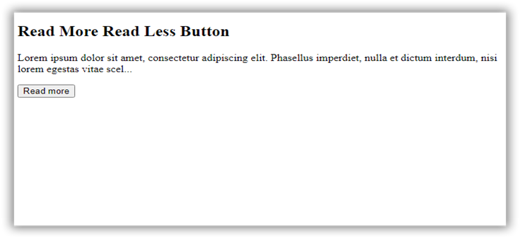
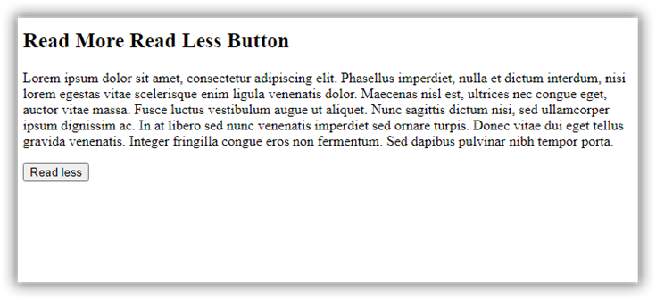
<h2>Read More Read Less Button</h2>
<p>Lorem ipsum dolor sit amet, consectetur adipiscing elit. Phasellus imperdiet, nulla et dictum interdum, nisi lorem egestas vitae scel<span id="dots">...</span><span id="more">erisque enim ligula venenatis dolor. Maecenas nisl est, ultrices nec congue eget, auctor vitae massa. Fusce luctus vestibulum augue ut aliquet. Nunc sagittis dictum nisi, sed ullamcorper ipsum dignissim ac. In at libero sed nunc venenatis imperdiet sed ornare turpis. Donec vitae dui eget tellus gravida venenatis. Integer fringilla congue eros non fermentum. Sed dapibus pulvinar nibh tempor porta.</span></p>
<button onclick="myFunction()" id="myBtn">Read more</button>
<script>
function myFunction() {
var dots = document.getElementById("dots");
var moreText = document.getElementById("more");
var btnText = document.getElementById("myBtn");
if (dots.style.display === "none") {
dots.style.display = "inline";
btnText.innerHTML = "Read more";
moreText.style.display = "none";
} else {
dots.style.display = "none";
btnText.innerHTML = "Read less";
moreText.style.display = "inline";
}
}
</script>
</body>
</html>
عکس اول : دکمه "بیشتر بخوانید" یا Read More
عکس دوم : دکمه "کمتر بخوانید" یا Read Less
| امتياز : | نتيجه : 0 امتياز توسط 0 نفر مجموع امتياز : 0 |
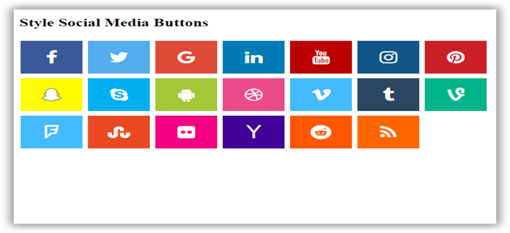
آموزش طراحی سایت - دکمه شبکه های اجتماعی در سایت
تاريخ: امروز, : یکشنبه 26 اردیبهشت 1400 نويسنده: http://tahlilgardadeh.rozblog.com/user-admin
موضوع: آموزش طراحی سایت ,
آموزش طراحی سایت - دکمه شبکه های اجتماعی در سایت
آموزش تصویری طراحی سایت
دکمه شبکه های اجتماعی در سایت
در این مقاله می آموزیم که چطور با استفاده از کد CSS , Html ، دکمه های شبکه های اجتماعی (Social Media Buttons) ایجاد کنیم.
چطور دکمه های رسانه های اجتماعی را فرم دهیم
قدم اول : کد HTML را اضافه کنید.
مثال :
 <!-- Add icon library -->
<link rel="stylesheet" href="https://cdnjs.cloudflare.com/ajax/libs/font-awesome/4.7.0/css/font-awesome.min.css">

                    <!-- Add font awesome icons -->
<a href="#" class="fa fa-facebook"></a>
<a href="#" class="fa fa-twitter"></a>مثال :
                  /* Style all font awesome icons */
.fa {
  padding: 20px;
  font-size: 30px;
  width: 50px;
  text-align: center;
  text-decoration: none;
}

/* Add a hover effect if you want */
.fa:hover {
  opacity: 0.7;
}

/* Set a specific color for each brand */

/* Facebook */
.fa-facebook {
  background: #3B5998;
  color: white;
}

/* Twitter */
.fa-twitter {
  background: #55ACEE;
  color: white;
}
نمونه یک
| امتياز : | نتيجه : 0 امتياز توسط 0 نفر مجموع امتياز : 0 |
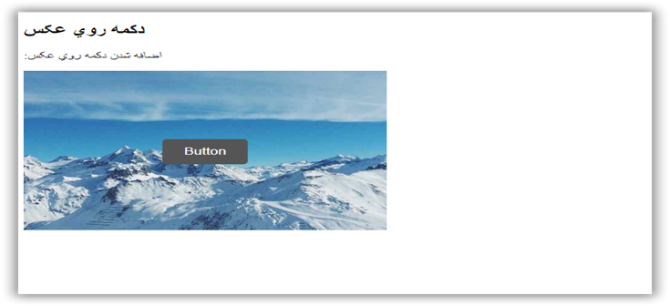
آموزش ساخت دکمه روي عکس (Button on Image) در وبسايت
تاريخ: امروز, : سه شنبه 21 اردیبهشت 1400 نويسنده: http://tahlilgardadeh.rozblog.com/user-admin
موضوع: آموزش طراحی سایت ,
دوره آموزش طراحی سایت-آموزش ساخت دکمه روي عکس (Button on Image) در وبسايت
آموزش ساخت دکمه روي عکس (Button on Image) در سایت
در این مقاله می آموزیم که چطور با استفاده از کد CSS , Html ، دکمه روي عکسي (split button) ایجاد کنیم.
Split Button Dropdowns
قدم اول : کد HTML را اضافه کنید.
مثال :
<div class="container">
    <img src="img_snow.jpg" alt="Snow">
    <button class="btn">Button</button>
       </div>
قدم دوم : کد CSS را اضافه کنید.
 /* Container needed to position the button. Adjust the width as needed */
.container {
  position: relative;
  width: 50%;
}

/* Make the image responsive */
.container img {
  width: 100%;
  height: auto;
}

/* Style the button and place it in the middle of the container/image */
.container .btn {
  position: absolute;
  top: 50%;
  left: 50%;
  transform: translate(-50%, -50%);
  -ms-transform: translate(-50%, -50%);
  background-color: #555;
  color: white;
  font-size: 16px;
  padding: 12px 24px;
  border: none;
  cursor: pointer;
  border-radius: 5px;
}

.container .btn:hover {
  background-color: black;
}
نمونه یک
<!DOCTYPE html>
<html>
<head>
<meta name="viewport" content="width=device-width, initial-scale=1">
<style>
.container {
  position: relative;
  width: 100%;
  max-width: 400px;
}

.container img {
  width: 100%;
  height: auto;
}

.container .btn {
  position: absolute;
  top: 50%;
  left: 50%;
  transform: translate(-50%, -50%);
  -ms-transform: translate(-50%, -50%);
  background-color: #555;
  color: white;
  font-size: 16px;
  padding: 12px 24px;
  border: none;
  cursor: pointer;
  border-radius: 5px;
  text-align: center;
}

.container .btn:hover {
  background-color: black;
}
</style>
</head>
<body>

<h2>دکمه روي عکس</h2>
<p>:اضافه شدن دکمه روي عکس</p>

<div class="container">
  <img src="http://articles.tahlildadeh.com/image.axd?picture=webads.jpg" alt="Snow" style="width:100%">
  <button class="btn">Button</button>
</div>

</body>
</html>
| امتياز : | نتيجه : 2 امتياز توسط 1 نفر مجموع امتياز : 2 |
