

دانلود فايل , شرکت در انجمن و گفتگو با ساير اعضا در سايت ثبت نام کنيد
آموزش Image Grid
تاريخ: امروز, : یکشنبه 17 مرداد 1400 نويسنده: http://tahlilgardadeh.rozblog.com/user-admin
موضوع: آموزش طراحی سایت ,
آموزش Image Grid
دانلود آموزش طراحی سایت
آموزش ساخت Image Grid
در این مقاله می آموزید که چطور یک شبکه تصویر (image grid) با استفاده از CSS و جاوا اسکريپت ایجاد کنید
در این مقاله می آموزید چطور یک گالری تصویر ایجاد کنید که تعداد چهار تصویر یا دو تصویر یا تصاویر تمام عرض با کلیک بر روی یک دکمه ، تمایز ایجاد کند.
قدم اول : کد HTML را اضافه کنید.
مثال :
            <div class="row">
  <div class="column">
    <img src=" http://articles.tahlildadeh.com/image.axd?picture=stones.jpg">
    <img src=" http://articles.tahlildadeh.com/image.axd?picture=rocks.jpg">
    <img src=" http://articles.tahlildadeh.com/image.axd?picture=falls2.jpg">
    <img src=" http://articles.tahlildadeh.com/image.axd?picture=paris.jpg">
    <img src=" http://articles.tahlildadeh.com/image.axd?picture=nature_4.jpg">
    <img src=" http://articles.tahlildadeh.com/image.axd?picture=mist.jpg">
    <img src=" http://articles.tahlildadeh.com/image.axd?picture=paris.jpg">
  </div>
  <div class="column">
    <img src=" http://articles.tahlildadeh.com/image.axd?picture=new-nature.jpg">
    <img src=" http://articles.tahlildadeh.com/image.axd?picture=ocean.jpg">
    <img src=" http://articles.tahlildadeh.com/image.axd?picture=stones.jpg">
    <img src=" http://articles.tahlildadeh.com/image.axd?picture=mountainskies.jpg">
    <img src=" http://articles.tahlildadeh.com/image.axd?picture=rocks.jpg">
    <img src=" http://articles.tahlildadeh.com/image.axd?picture=new-nature.jpg">
  </div>
  <div class="column">
    <img src=" http://articles.tahlildadeh.com/image.axd?picture=stones.jpg">
    <img src=" http://articles.tahlildadeh.com/image.axd?picture=rocks.jpg">
    <img src=" http://articles.tahlildadeh.com/image.axd?picture=falls2.jpg">
    <img src=" http://articles.tahlildadeh.com/image.axd?picture=paris.jpg">
    <img src=" http://articles.tahlildadeh.com/image.axd?picture=nature_4.jpg">
    <img src=" http://articles.tahlildadeh.com/image.axd?picture=mist.jpg">
    <img src=" http://articles.tahlildadeh.com/image.axd?picture=paris.jpg">
  </div>
  <div class="column">
    <img src=" http://articles.tahlildadeh.com/image.axd?picture=new-nature.jpg">
    <img src=" http://articles.tahlildadeh.com/image.axd?picture=ocean.jpg">
    <img src=" http://articles.tahlildadeh.com/image.axd?picture=stones.jpg">
    <img src=" http://articles.tahlildadeh.com/image.axd?picture=mountainskies.jpg">
    <img src=" http://articles.tahlildadeh.com/image.axd?picture=rocks.jpg">
    <img src=" http://articles.tahlildadeh.com/image.axd?picture=new-nature.jpg">
  </div>
</div>
قدم دوم : کد CSS را اضافه کنید.
مثال :
برای ایجاد یک چیدمان واکنش گرا از CSS Flexbox استفاده کنید
قدم سوم : کد جاوا اسکریپت را اضافه کنید.
مثال :
با استفاده از کد جاوا اسکریپت یک Grid View قابل کنترل ایجاد کنید:
نمونه مثال Image Grid:
| امتياز : | نتيجه : 0 امتياز توسط 0 نفر مجموع امتياز : 0 |

طراحی شبکه تصاویر واکنش گرا
تاريخ: امروز, : سه شنبه 29 تیر 1400 نويسنده: http://tahlilgardadeh.rozblog.com/user-admin
موضوع: آموزش طراحی سایت ,
طراحی شبکه تصاویر واکنش گرا
دانلود آموزش طراحی سایت
طراحی شبکه تصاویر واکنش گرا با Responsive Image Grid
در این مقاله می آموزید که چگونه یک شبکه تصویر (image grid) ریسپانسیو با استفاده از CSS و جاوا اسکريپت ایجاد کنید
در این مقاله می آموزید چطور یک شبکه تصویر ایجاد کنید که تعداد چهار یا دو تصویر تمام عرض را بنا بر سایز صفحه نمایش ، از هم متمایز کند.
یک شبکه تصویر ایجاد کنید
قدم اول : کد HTML را اضافه کنید.
مثال :
قدم دوم : کد CSS را اضافه کنید.
مثال :
برای ایجاد یک چیدمان واکنش گرا از CSS Flexbox استفاده کنید
         <div class="row">
  <div class="column">
    <img src=" http://articles.tahlildadeh.com/image.axd?picture=wedding.jpg">
    <img src=" http://articles.tahlildadeh.com/image.axd?picture=rocks.jpg">
    <img src=" http://articles.tahlildadeh.com/image.axd?picture=falls2.jpg">
    <img src=" http://articles.tahlildadeh.com/image.axd?picture=paris.jpg">
    <img src=" http://articles.tahlildadeh.com/image.axd?picture=nature_4.jpg">
    <img src=" http://articles.tahlildadeh.com/image.axd?picture=mist.jpg">
    <img src=" http://articles.tahlildadeh.com/image.axd?picture=paris.jpg">
  </div>
  <div class="column">
    <img src=" http://articles.tahlildadeh.com/image.axd?picture=underwater.jpg">
    <img src=" http://articles.tahlildadeh.com/image.axd?picture=ocean.jpg">
    <img src=" http://articles.tahlildadeh.com/image.axd?picture=wedding.jpg">
    <img src=" http://articles.tahlildadeh.com/image.axd?picture=mountainskies.jpg">
    <img src=" http://articles.tahlildadeh.com/image.axd?picture=rocks.jpg ">
    <img src=" http://articles.tahlildadeh.com/image.axd?picture=underwater.jpg ">
  </div>
  <div class="column">
    <img src=" http://articles.tahlildadeh.com/image.axd?picture=wedding.jpg ">
    <img src=" http://articles.tahlildadeh.com/image.axd?picture=rocks.jpg ">
    <img src=" http://articles.tahlildadeh.com/image.axd?picture=falls2.jpg ">
    <img src=" http://articles.tahlildadeh.com/image.axd?picture=paris.jpg ">
    <img src=" http://articles.tahlildadeh.com/image.axd?picture=nature_4.jpg ">
    <img src=" http://articles.tahlildadeh.com/image.axd?picture=mist.jpg ">
    <img src=" http://articles.tahlildadeh.com/image.axd?picture=paris.jpg ">
  </div>
  <div class="column">
    <img src="http://articles.tahlildadeh.com/image.axd?picture=underwater.jpg ">
    <img src=" http://articles.tahlildadeh.com/image.axd?picture=ocean.jpg ">
    <img src="http://articles.tahlildadeh.com/image.axd?picture=wedding.jpg ">
    <img src=" http://articles.tahlildadeh.com/image.axd?picture=mountainskies.jpg ">
    <img src=" http://articles.tahlildadeh.com/image.axd?picture=rocks.jpg ">
    <img src=" http://articles.tahlildadeh.com/image.axd?picture=underwater.jpg ">
  </div>
</div>
جهت مشاهده نمونه مثال ها برروی دوره آموزش طراحی سایت کلیک نمایید.
| امتياز : | نتيجه : 0 امتياز توسط 0 نفر مجموع امتياز : 0 |
آموزش ساخت تصاویر لایت باکس
تاريخ: امروز, : دوشنبه 28 تیر 1400 نويسنده: http://tahlilgardadeh.rozblog.com/user-admin
موضوع: آموزش طراحی سایت ,
آموزش ساخت تصاویر لایت باکس
دانلود آموزش طراحی سایت
آموزش ساخت لایت باکس LightBox
در این مقاله می آموزید که چطور یک گالری تصویر مدرن (LightBox) با استفاده از CSS و جاوا اسکريپت ایجاد کنید
روی یکی از تصاویر زیر کلیک کنید تا Lightbox باز شود :
مثال زیر ترکیبی از کدهای Modal و Slideshow را برای ایجاد Lightbox نشان میدهد :
قدم اول : کد HTML را اضافه کنید.
مثال :
          <!-- Images used to open the lightbox -->
<div class="row">
  <div class="column">
    <img src=" http://articles.tahlildadeh.com/image.axd?picture=img_nature_wide.jpg" onclick="openModal();currentSlide(1)" class="hover-shadow">
  </div>
  <div class="column">
    <img src=" http://articles.tahlildadeh.com/image.axd?picture=img_snow_wide.jpg" onclick="openModal();currentSlide(2)" class="hover-shadow">
  </div>
  <div class="column">
    <img src=" http://articles.tahlildadeh.com/image.axd?picture=img_mountains_wide.jpg" onclick="openModal();currentSlide(3)" class="hover-shadow">
  </div>
  <div class="column">
    <img src="img4.jpg" onclick="openModal();currentSlide(4)" class="hover-shadow">
  </div>
</div>

                    <!-- The Modal/Lightbox -->
<div id="myModal" class="modal">
  <span class="close cursor" onclick="closeModal()">×</span>
  <div class="modal-content">

    <div class="mySlides" style="display: block;">
      <div class="numbertext">1 / 4</div>
      <img src=" http://articles.tahlildadeh.com/image.axd?picture=img_nature_wide.jpg" style="width:100%">
    </div>

    <div class="mySlides" style="display: none;">
      <div class="numbertext">2 / 4</div>
      <img src=" http://articles.tahlildadeh.com/image.axd?picture=img_snow_wide.jpg" style="width:100%">
    </div>

    <div class="mySlides" style="display: none;">
      <div class="numbertext">3 / 4</div>
      <img src=" http://articles.tahlildadeh.com/image.axd?picture=img_mountains_wide.jpg" style="width:100%">
    </div>

    <div class="mySlides" style="display: none;">
      <div class="numbertext">4 / 4</div>
      <img src="img4_wide.jpg" style="width:100%">
    </div>

      <!-- Next/previous controls -->
    <a class="prev" onclick="plusSlides(-1)">❮</a>
    <a class="next" onclick="plusSlides(1)">❯</a>

      <!-- Caption text -->
    <div class="caption-container">
      <p id="caption">Nature</p>
    </div>

      <!-- Thumbnail image controls -->
    <div class="column">
      <img class="demo active" src="img1.jpg" onclick="currentSlide(1)" alt="Nature">
    </div>

    <div class="column">
      <img class="demo" src="img2.jpg" onclick="currentSlide(2)" alt="Snow">
    </div>

    <div class="column">
      <img class="demo" src="img3.jpg" onclick="currentSlide(3)" alt="Mountains">
    </div>

    <div class="column">
      <img class="demo" src="img4.jpg" onclick="currentSlide(4)" alt="Lights">
    </div>
  </div>
</div>
قدم دوم : کد CSS را اضافه کنید.
مثال :
 .row > .column {
  padding: 0 8px;
}

.row:after {
  content: "";
  display: table;
  clear: both;
}

/* Create four equal columns that floats next to eachother */
.column {
  float: left;
  width: 25%;
}

/* The Modal (background) */
.modal {
  display: none;
  position: fixed;
  z-index: 1;
  padding-top: 100px;
  left: 0;
  top: 0;
  width: 100%;
  height: 100%;
  overflow: auto;
  background-color: black;
}

/* Modal Content */
.modal-content {
  position: relative;
  background-color: #fefefe;
  margin: auto;
  padding: 0;
  width: 90%;
  max-width: 1200px;
}

/* The Close Button */
.close {
  color: white;
  position: absolute;
  top: 10px;
  right: 25px;
  font-size: 35px;
  font-weight: bold;
}

.close:hover,
.close:focus {
  color: #999;
  text-decoration: none;
  cursor: pointer;
}

/* Hide the slides by default */
.mySlides {
  display: none;
}

/* Next & previous buttons */
.prev,
.next {
  cursor: pointer;
  position: absolute;
  top: 50%;
  width: auto;
  padding: 16px;
  margin-top: -50px;
  color: white;
  font-weight: bold;
  font-size: 20px;
  transition: 0.6s ease;
  border-radius: 0 3px 3px 0;
  user-select: none;
  -webkit-user-select: none;
}

/* Position the "next button" to the right */
.next {
  right: 0;
  border-radius: 3px 0 0 3px;
}

/* On hover, add a black background color with a little bit see-through */
.prev:hover,
.next:hover {
  background-color: rgba(0, 0, 0, 0.8);
}

/* Number text (1/3 etc) */
.numbertext {
  color: #f2f2f2;
  font-size: 12px;
  padding: 8px 12px;
  position: absolute;
  top: 0;
}

/* Caption text */
.caption-container {
  text-align: center;
  background-color: black;
  padding: 2px 16px;
  color: white;
}

img.demo {
  opacity: 0.6;
}

.active,
.demo:hover {
  opacity: 1;
}

img.hover-shadow {
  transition: 0.3s;
}

.hover-shadow:hover {
  box-shadow: 0 4px 8px 0 rgba(0, 0, 0, 0.2), 0 6px 20px 0 rgba(0, 0, 0, 0.19);
قدم سوم : کد جاوا اسکریپت را اضافه کنید.
مثال :
<script>
// Open the Modal
function openModal() {
    document.getElementById("myModal").style.display = "block";
}

// Close the Modal
function closeModal() {
    document.getElementById("myModal").style.display = "none";
}

var slideIndex = 1;
showSlides(slideIndex);

// Next/previous controls
function plusSlides(n) {
    showSlides(slideIndex += n);
}

// Thumbnail image controls
function currentSlide(n) {
    showSlides(slideIndex = n);
}

function showSlides(n) {
    var i;
    var slides = document.getElementsByClassName("mySlides");
    var dots = document.getElementsByClassName("demo");
    var captionText = document.getElementById("caption");
    if (n > slides.length) {slideIndex = 1}
    if (n < 1) {slideIndex = slides.length}
    for (i = 0; i < slides.length; i++) {
        slides[i].style.display = "none";
    }
    for (i = 0; i < dots.length; i++) {
        dots[i].className = dots[i].className.replace(" active", "");
    }
    slides[slideIndex-1].style.display = "block";
    dots[slideIndex-1].className += " active";
    captionText.innerHTML = dots[slideIndex-1].alt;
}
</script>
نمونه مثال Lightbox:
| امتياز : | نتيجه : 0 امتياز توسط 0 نفر مجموع امتياز : 0 |
آموزش ساخت Image Modal با استفاده از HTML و CSS3
تاريخ: امروز, : چهارشنبه 23 تیر 1400 نويسنده: http://tahlilgardadeh.rozblog.com/user-admin
موضوع: آموزش طراحی سایت ,
یادگیری طراحی وب
آموزش ساخت Modal Image
در این مقاله می آموزید که یک Modal Image واکنش گرا با استفاده از CSS و جاوا اسکريپت ایجاد کنید
Modal یک کادر ارتباطی ( محاوره ای ) یا پنجره popup است که در بالای صفحه ای که داخل آن هستید نمایش داده میشود.
این مثال از اکثر کدهای مثال قبلی (Modal Box) استفاده کرده است، با این تفاوت که در این مثال از تصاویر استفاده میکنیم.
قدم اول : کد HTML را اضافه کنید.
مثال :
            <!-- Trigger the Modal -->
<img id="myImg" src="http://articles.tahlildadeh.com/image.axd?picture=img_snow_wide.jpg" alt="Snow" style="width:100%;max-width:300px">

                    <!-- The Modal -->
<div id="myModal" class="modal">

  <!-- The Close Button -->
  <span class="close">×</span>

    <!-- Modal Content (The Image) -->
  <img class="modal-content" id="img01">

    <!-- Modal Caption (Image Text) -->
  <div id="caption"></div>
</div>
قدم دوم : کد CSS را اضافه کنید.
مثال :
قدم سوم : کد جاوا اسکریپت را اضافه کنید.
مثال :
نمونه مثال Image Modal :
برای مشاهده این نمونه برروی دوره آموزش طراحی سایت کلیک نمایید.
| امتياز : | نتيجه : 0 امتياز توسط 0 نفر مجموع امتياز : 0 |
آموزش ساخت گالری اسلاید شو برای سایت
تاريخ: امروز, : سه شنبه 22 تیر 1400 نويسنده: http://tahlilgardadeh.rozblog.com/user-admin
موضوع: آموزش طراحی سایت ,
آموزش ساخت گالری اسلاید شو برای سایت
یادگیری طراحی وب
آموزش ساخت گالری اسلايدشو
در این مقاله می آموزیم که چطور با استفاده از کد CSS , Html و جاوا اسكريپت Slideshow Gallery ایجاد کنیم.
قدم اول : کد HTML را اضافه کنید.
مثال :
    <!-- Container for the image gallery -->
<div class="container">

  <!-- Full-width images with number text -->
  <div class="mySlides">
    <div class="numbertext">1 / 6</div>
      <img src="http://articles.tahlildadeh.com/image.axd?picture=img_woods_wide.jpg" style="width:100%">
  </div>

  <div class="mySlides">
    <div class="numbertext">2 / 6</div>
      <img src="http://articles.tahlildadeh.com/image.axd?picture=img_5terre_wide.jpg" style="width:100%">
  </div>

  <div class="mySlides">
    <div class="numbertext">3 / 6</div>
      <img src="http://articles.tahlildadeh.com/image.axd?picture=img_mountains_wide.jpg" style="width:100%">
  </div>

  <div class="mySlides">
    <div class="numbertext">4 / 6</div>
      <img src="http://articles.tahlildadeh.com/image.axd?picture=img_lights_wide.jpg" style="width:100%">
  </div>

  <div class="mySlides">
    <div class="numbertext">5 / 6</div>
      <img src="http://articles.tahlildadeh.com/image.axd?picture=img_nature_wide.jpg" style="width:100%">
  </div>

  <div class="mySlides">
    <div class="numbertext">6 / 6</div>
      <img src="http://articles.tahlildadeh.com/image.axd?picture=img_snow_wide.jpg" style="width:100%">
  </div>

    <!-- Next and previous buttons -->
  <a class="prev" onclick="plusSlides(-1)">❮</a>
  <a class="next" onclick="plusSlides(1)">❯</a>

    <!-- Image text -->
  <div class="caption-container">
    <p id="caption"></p>
  </div>

    <!-- Thumbnail images -->
  <div class="row">
    <div class="column">
      <img class="demo cursor" src="http://articles.tahlildadeh.com/image.axd?picture=img_woods_wide.jpg" style="width:100%" onclick="currentSlide(1)" alt="The Woods">
    </div>
    <div class="column">
      <img class="demo cursor" src="http://articles.tahlildadeh.com/image.axd?picture=img_5terre_wide.jpg" style="width:100%" onclick="currentSlide(2)" alt="Cinque Terre">
    </div>
    <div class="column">
      <img class="demo cursor" src="http://articles.tahlildadeh.com/image.axd?picture=img_mountains_wide.jpg" style="width:100%" onclick="currentSlide(3)" alt="Mountains and fjords">
    </div>
    <div class="column">
      <img class="demo cursor" src="http://articles.tahlildadeh.com/image.axd?picture=img_lights_wide.jpg" style="width:100%" onclick="currentSlide(4)" alt="Northern Lights">
    </div>
    <div class="column">
      <img class="demo cursor" src="http://articles.tahlildadeh.com/image.axd?picture=img_nature_wide.jpg" style="width:100%" onclick="currentSlide(5)" alt="Nature and sunrise">
    </div>
    <div class="column">
      <img class="demo cursor" src="http://articles.tahlildadeh.com/image.axd?picture=img_snow_wide.jpg" style="width:100%" onclick="currentSlide(6)" alt="Snowy Mountains">
    </div>
  </div>
</div>
قدم دوم : کد CSS را اضافه کنید.
مثال :
              * {
  box-sizing: border-box;
}

/* Position the image container (needed to position the left and right arrows) */
.container {
  position: relative;
}

/* Hide the images by default */
.mySlides {
  display: none;
}

/* Add a pointer when hovering over the thumbnail images */
.cursor {
  cursor: pointer;
}

/* Next & previous buttons */
.prev,
.next {
  cursor: pointer;
  position: absolute;
  top: 40%;
  width: auto;
  padding: 16px;
  margin-top: -50px;
  color: white;
  font-weight: bold;
  font-size: 20px;
  border-radius: 0 3px 3px 0;
  user-select: none;
  -webkit-user-select: none;
}

/* Position the "next button" to the right */
.next {
  right: 0;
  border-radius: 3px 0 0 3px;
}

/* On hover, add a black background color with a little bit see-through */
.prev:hover,
.next:hover {
  background-color: rgba(0, 0, 0, 0.8);
}

/* Number text (1/3 etc) */
.numbertext {
  color: #f2f2f2;
  font-size: 12px;
  padding: 8px 12px;
  position: absolute;
  top: 0;
}

/* Container for image text */
.caption-container {
  text-align: center;
  background-color: #222;
  padding: 2px 16px;
  color: white;
}

.row:after {
  content: "";
  display: table;
  clear: both;
}

/* Six columns side by side */
.column {
  float: left;
  width: 16.66%;
}

/* Add a transparency effect for thumnbail images */
.demo {
  opacity: 0.6;
}

.active,
.demo:hover {
  opacity: 1;
}
قدم سوم : کد جاوا اسکریپت را اضافه کنید.
مثال :
    var slideIndex = 1;
showSlides(slideIndex);

// Next/previous controls
function plusSlides(n) {
  showSlides(slideIndex += n);
}

// Thumbnail image controls
function currentSlide(n) {
  showSlides(slideIndex = n);
}

function showSlides(n) {
  var i;
  var slides = document.getElementsByClassName("mySlides");
  var dots = document.getElementsByClassName("demo");
  var captionText = document.getElementById("caption");
  if (n > slides.length) {slideIndex = 1}
  if (n < 1) {slideIndex = slides.length}
  for (i = 0; i < slides.length; i++) {
    slides[i].style.display = "none";
  }
  for (i = 0; i < dots.length; i++) {
    dots[i].className = dots[i].className.replace(" active", "");
  }
  slides[slideIndex-1].style.display = "block";
  dots[slideIndex-1].className += " active";
  captionText.innerHTML = dots[slideIndex-1].alt;
}
نمونه مثال گالری اسلاید شو
| امتياز : | نتيجه : 0 امتياز توسط 0 نفر مجموع امتياز : 0 |
آموزش ساخت اسلايدشو براي وبسايت
تاريخ: امروز, : سه شنبه 15 تیر 1400 نويسنده: http://tahlilgardadeh.rozblog.com/user-admin
موضوع: آموزش طراحی سایت ,
یادگیری طراحی وب
آموزش ساخت اسلايدشو
در این مقاله می آموزیم که چطور با استفاده از کد CSS , Html و جاوا اسكريپت Slideshow ایجاد کنیم.
قسمت اول : ايجاد Slideshow در وب سایت
قدم اول : کد HTML را اضافه کنید.
مثال :
 <!-- Slideshow container -->
<div class="slideshow-container">

  <!-- Full-width images with number and caption text -->
  <div class="mySlides fade">
    <div class="numbertext">1 / 3</div>
    <img src="img1.jpg" style="width:100%">
    <div class="text">Caption Text</div>
  </div>

  <div class="mySlides fade">
    <div class="numbertext">2 / 3</div>
    <img src="img2.jpg" style="width:100%">
    <div class="text">Caption Two</div>
  </div>

  <div class="mySlides fade">
    <div class="numbertext">3 / 3</div>
    <img src="img3.jpg" style="width:100%">
    <div class="text">Caption Three</div>
  </div>

    <!-- Next and previous buttons -->
  <a class="prev" onclick="plusSlides(-1)">❮</a>
  <a class="next" onclick="plusSlides(1)">❯</a>
</div>
<br>

                    <!-- The dots/circles -->
<div style="text-align:center">
  <span class="dot" onclick="currentSlide(1)"></span>
  <span class="dot" onclick="currentSlide(2)"></span>
  <span class="dot" onclick="currentSlide(3)"></span>
</div>
قدم دوم : کد CSS را اضافه کنید.
مثال :
            * {box-sizing:border-box}

/* Slideshow container */
.slideshow-container {
  max-width: 1000px;
  position: relative;
  margin: auto;
}

/* Hide the images by default */
.mySlides {
  display: none;
}

/* Next & previous buttons */
.prev, .next {
  cursor: pointer;
  position: absolute;
  top: 50%;
  width: auto;
  margin-top: -22px;
  padding: 16px;
  color: white;
  font-weight: bold;
  font-size: 18px;
  transition: 0.6s ease;
  border-radius: 0 3px 3px 0;
  user-select: none;
}

/* Position the "next button" to the right */
.next {
  right: 0;
  border-radius: 3px 0 0 3px;
}

/* On hover, add a black background color with a little bit see-through */
.prev:hover, .next:hover {
  background-color: rgba(0,0,0,0.8);
}

/* Caption text */
.text {
  color: #f2f2f2;
  font-size: 15px;
  padding: 8px 12px;
  position: absolute;
  bottom: 8px;
  width: 100%;
  text-align: center;
}

/* Number text (1/3 etc) */
.numbertext {
  color: #f2f2f2;
  font-size: 12px;
  padding: 8px 12px;
  position: absolute;
  top: 0;
}

/* The dots/bullets/indicators */
.dot {
  cursor: pointer;
  height: 15px;
  width: 15px;
  margin: 0 2px;
  background-color: #bbb;
  border-radius: 50%;
  display: inline-block;
  transition: background-color 0.6s ease;
}

.active, .dot:hover {
  background-color: #717171;
}

/* Fading animation */
.fade {
  -webkit-animation-name: fade;
  -webkit-animation-duration: 1.5s;
  animation-name: fade;
  animation-duration: 1.5s;
}

@-webkit-keyframes fade {
  from {opacity: .4}
  to {opacity: 1}
}

@keyframes fade {
  from {opacity: .4}
  to {opacity: 1}
}
قدم سوم : کد جاوا اسکریپت را اضافه کنید.
مثال :
                var slideIndex = 1;
showSlides(slideIndex);

// Next/previous controls
function plusSlides(n) {
  showSlides(slideIndex += n);
}

// Thumbnail image controls
function currentSlide(n) {
  showSlides(slideIndex = n);
}

function showSlides(n) {
  var i;
  var slides = document.getElementsByClassName("mySlides");
  var dots = document.getElementsByClassName("dot");
  if (n > slides.length) {slideIndex = 1}
  if (n < 1) {slideIndex = slides.length}
  for (i = 0; i < slides.length; i++) {
      slides[i].style.display = "none";
  }
  for (i = 0; i < dots.length; i++) {
      dots[i].className = dots[i].className.replace(" active", "");
  }
  slides[slideIndex-1].style.display = "block";
  dots[slideIndex-1].className += " active";
}
| امتياز : | نتيجه : 0 امتياز توسط 0 نفر مجموع امتياز : 0 |
آموزش ساخت دکمه Back to Top برای صفحات وب
تاريخ: امروز, : سه شنبه 18 خرداد 1400 نويسنده: http://tahlilgardadeh.rozblog.com/user-admin
موضوع: آموزش طراحی سایت ,
آموزش ساخت دکمه Back to Top برای صفحات وب
یادگیری طراحی سایت
آموزش ساخت دکمه top ( برگشت به بالا)
در این مقاله می آموزیم که چطور با استفاده از کد CSS , Html دکمه های Scroll Back To Top Button ایجاد کنیم.
قدم اول : کد HTML را اضافه کنید.
مثال :
دکمه ای ایجاد کنید که هنگامیکه کاربر بر روی آن کلیک میکند به بالای صفحه بازگردد.
<button onclick="topFunction()" id="myBtn" title="Go to top">Top</button>
قدم دوم : کد CSS را اضافه کنید.
مثال :
               #myBtn {
  display: none; /* Hidden by default */
  position: fixed; /* Fixed/sticky position */
  bottom: 20px; /* Place the button at the bottom of the page */
  right: 30px; /* Place the button 30px from the right */
  z-index: 99; /* Make sure it does not overlap */
  border: none; /* Remove borders */
  outline: none; /* Remove outline */
  background-color: red; /* Set a background color */
  color: white; /* Text color */
  cursor: pointer; /* Add a mouse pointer on hover */
  padding: 15px; /* Some padding */
  border-radius: 10px; /* Rounded corners */
  font-size: 18px; /* Increase font size */
}

#myBtn:hover {
  background-color: #555; /* Add a dark-grey background on hover */
}
قدم سوم : کد جاوا اسکریپت را اضافه کنید.
مثال :
  //Get the button:
mybutton = document.getElementById("myBtn");

// When the user scrolls down 20px from the top of the document, show the button
window.onscroll = function() {scrollFunction()};

function scrollFunction() {
  if (document.body.scrollTop > 20 || document.documentElement.scrollTop > 20) {
    mybutton.style.display = "block";
  } else {
    mybutton.style.display = "none";
  }
}

// When the user clicks on the button, scroll to the top of the document
function topFunction() {
  document.body.scrollTop = 0; // For Safari
  document.documentElement.scrollTop = 0; // For Chrome, Firefox, IE and Opera
}
نمونه یک:
<!DOCTYPE html>
<html>
<head>
<meta name="viewport" content="width=device-width, initial-scale=1">
<style>
body {
  font-family: Arial, Helvetica, sans-serif;
  font-size: 20px;
}

#myBtn {
  display: none;
  position: fixed;
  bottom: 20px;
  right: 30px;
  z-index: 99;
  font-size: 18px;
  border: none;
  outline: none;
  background-color: red;
  color: white;
  cursor: pointer;
  padding: 15px;
  border-radius: 4px;
}

#myBtn:hover {
  background-color: #555;
}
</style>
</head>
<body>

<button onclick="topFunction()" id="myBtn" title="بالا برو">
بالا</button>

<div style="background-color:black;color:white;padding:30px">به پایین بروید</div>
<div style="background-color:lightgrey;padding:30px 30px 2500px">این مثال نحوه ایجاد دکمه "پیمایش به بالا" را نشان می دهد<strong> وقتی کاربر شروع به اسکرول صفحه می کند قابل مشاهده می گردد</strong></div>

<script>
//Get the button
var mybutton = document.getElementById("myBtn");

// When the user scrolls down 20px from the top of the document, show the button
window.onscroll = function() {scrollFunction()};

function scrollFunction() {
  if (document.body.scrollTop > 20 || document.documentElement.scrollTop > 20) {
    mybutton.style.display = "block";
  } else {
    mybutton.style.display = "none";
  }
}

// When the user clicks on the button, scroll to the top of the document
function topFunction() {
  document.body.scrollTop = 0;
  document.documentElement.scrollTop = 0;
}
</script>

</body>
</html>
جهت مشاهده تصاویر و خروجی برنامه برروی دوره آموزش طراحی سایت کلیک نمایید
| امتياز : | نتيجه : 0 امتياز توسط 0 نفر مجموع امتياز : 0 |
گرد کردن گوشه دکمه ها با CSS
تاريخ: امروز, : دوشنبه 17 خرداد 1400 نويسنده: http://tahlilgardadeh.rozblog.com/user-admin
موضوع: آموزش طراحی سایت ,
گرد کردن گوشه دکمه ها با CSS
یادگیری طراحی سایت
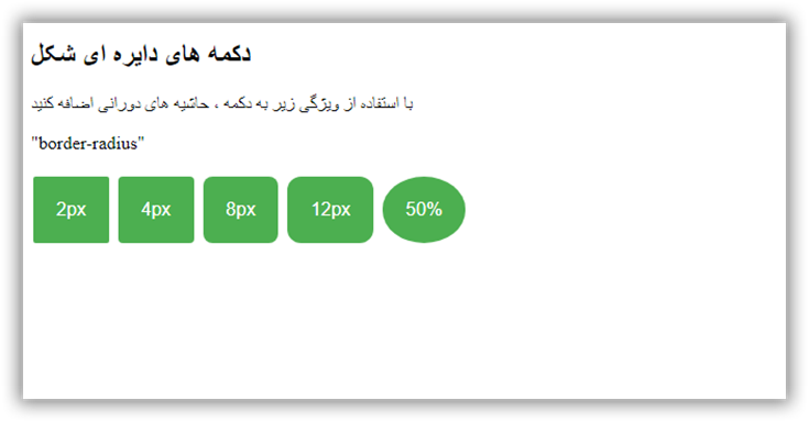
آموزش ساخت دکمه های دایره ای شکل
در این مقاله می آموزیم که چطور با استفاده از کد CSS , Html دکمه های Round Buttons ایجاد کنیم.
قدم اول : کد HTML را اضافه کنید.
مثال :
<button class="button button1">2px</button>
<button class="button button2">4px</button>
<button class="button button3">8px</button>
<button class="button button4">12px</button>
<button class="button button5">50%</button>
قدم دوم : کد CSS را اضافه کنید.
مثال :
               .button {
  background-color: #4CAF50;
  border: none;
  color: white;
  padding: 20px;
  text-align: center;
  text-decoration: none;
  display: inline-block;
  font-size: 16px;
  margin: 4px 2px;
}

.button1 {border-radius: 2px;}
.button2 {border-radius: 4px;}
.button3 {border-radius: 8px;}
.button4 {border-radius: 12px;}
.button5 {border-radius: 50%;}
نمونه یک:
نمونه دکمه Round Buttons
 جهت مشاهده کدها برروی دوره آموزش طراحی سایت کلیک نمایید
| امتياز : | نتيجه : 5 امتياز توسط 1 نفر مجموع امتياز : 5 |
آموزش ساخت دکمه با متن
تاريخ: امروز, : چهارشنبه 12 خرداد 1400 نويسنده: http://tahlilgardadeh.rozblog.com/user-admin
موضوع: آموزش طراحی سایت ,
آموزش طراحی سایت - آموزش ساخت دکمه با متن
یادگیری طراحی سایت
آموزش ساخت دکمه های متنی در سایت
در این مقاله می آموزیم که چطور با استفاده از کد CSS , Html دکمه های Text Buttons ایجاد کنیم.
قسمت اول :
قدم اول : کد HTML را اضافه کنید.
مثال :
<button class="btn success">Success</button>
<button class="btn info">Info</button>
<button class="btn warning">Warning</button>
<button class="btn danger">Danger</button>
<button class="btn default">Default</button>
قدم دوم : کد CSS را اضافه کنید.
مثال :
   .btn {
  border: none;
  background-color: inherit;
  padding: 14px 28px;
  font-size: 16px;
  cursor: pointer;
  display: inline-block;
}

/* On mouse-over */
.btn:hover {background: #eee;}

.success {color: green;}
.info {color: dodgerblue;}
.warning {color: orange;}
.danger {color: red;}
.default {color: black;}
نمونه یک:
| امتياز : | نتيجه : 0 امتياز توسط 0 نفر مجموع امتياز : 0 |
آموزش ساخت دکمه های تمام عرض در سایت
تاريخ: امروز, : دوشنبه 10 خرداد 1400 نويسنده: http://tahlilgardadeh.rozblog.com/user-admin
موضوع: آموزش طراحی سایت ,
آموزش طراحی سایت - آموزش ساخت دکمه های تمام عرض در سایت
یادگیری طراحی سایت
آموزش ساخت دکمه های تمام عرض در سایت
در این مقاله می آموزیم که چطور با استفاده از کد CSS , Html دکمه های Full Width (Block) Buttons ایجاد کنیم.
قدم اول : کد HTML را اضافه کنید.
مثال :
<button type="button" class="block">Block Button</button>
قدم دوم : کد CSS را اضافه کنید.
مثال :
   .block {
  display: block;
  width: 100%;
  border: none;
  background-color: #4CAF50;
  padding: 14px 28px;
  font-size: 16px;
  cursor: pointer;
  text-align: center;
}
نمونه یک
_Buttons.png)
| امتياز : | نتيجه : 5 امتياز توسط 1 نفر مجموع امتياز : 5 |
